Star Trek Paperback Covers
Saturday, March 7th, 2015 • Books / Design / Writing
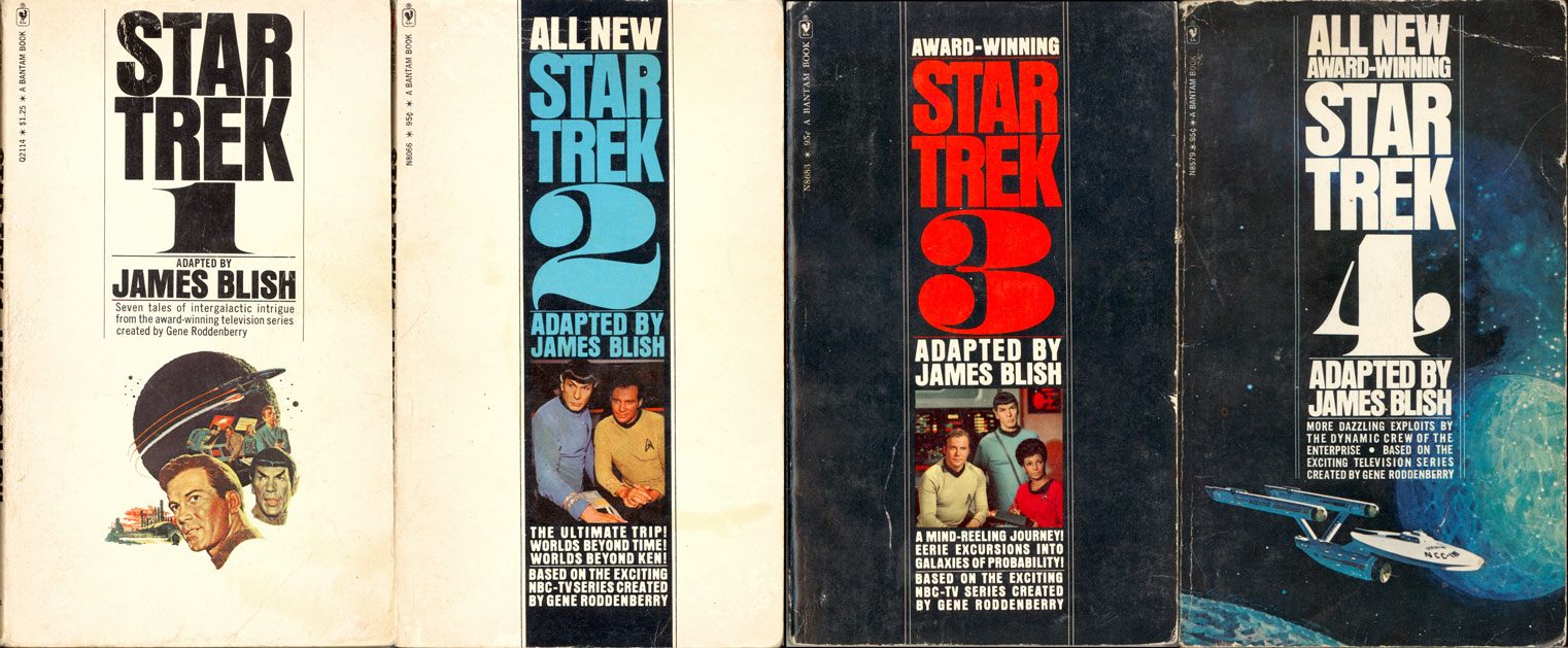
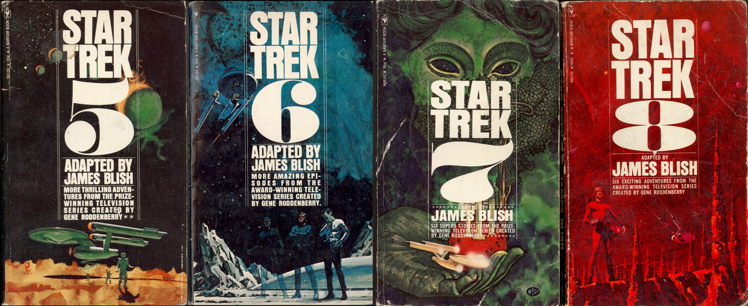
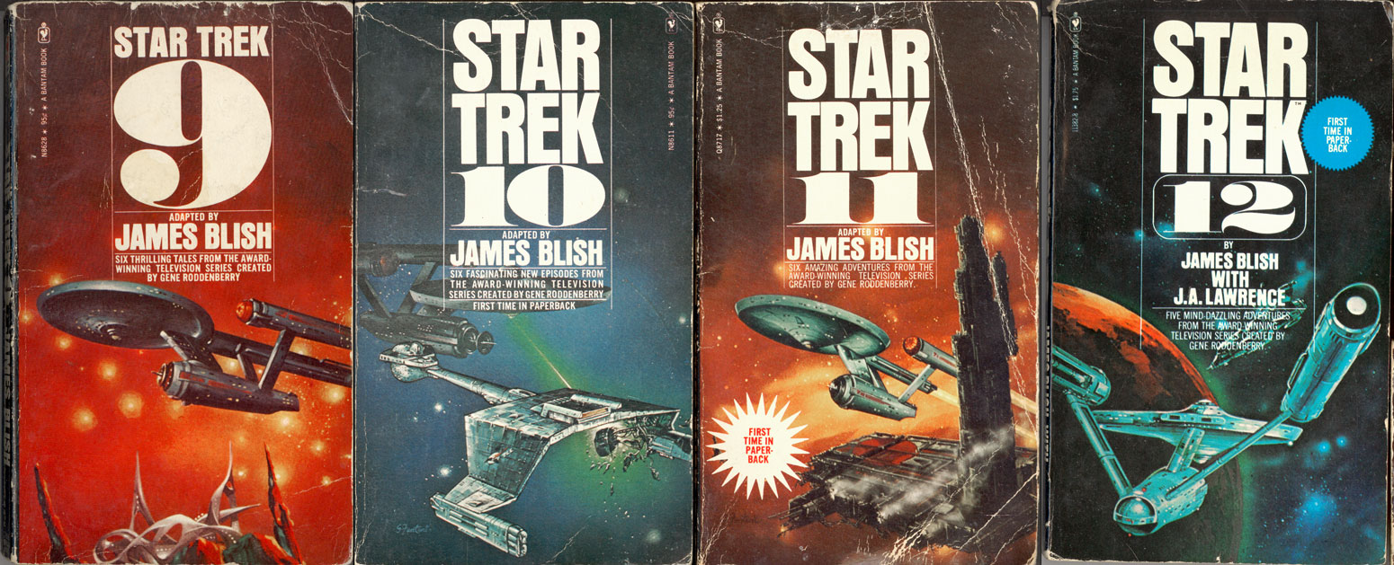
As I mentioned in my Slate article about Leonard Nimoy, “The stacks of Star Trek paperbacks we all bought…had glorious oil paintings on their covers that depicted the Trek universe with baroque realism that far surpassed the cheap effects of the show.” Probably the best example from the early-to-mid-’Seventies (Star Trek’s “decade in the wilderness,” when “the show was long gone, apparently never to return”) were these slim paperback originals from Bantam Books, which contained prose-ified versions of the shooting scripts from all 79 original series episodes.
British sci-fi author James Blish was contracted by Paramount to write these adaptations, which he (pretty clearly) knocked out as fast as he could. Inadequacies abound: not only were the Blish versions based on early drafts of the scripts (which meant that the plots abruptly went astray from the TV versions) and not only was Blish clearly operating from a very feeble level of familiarity with the show, but, more subtly, Blish was clearly a traditional old-school sci-fi author (emphatically not part of the contemporaneous “New Wave” that included Larry Niven, J. G. Ballard, Philip K. Dick and Trek contributor Harlan Ellison), so that reading his loose interpretation of the TV scripts is like going backwards in time to a much more reactionary 1940s-1950s conception of the future (and of narrative fiction), complete with all of the anachronistic racial and gender stereotypes that Gene Roddenberry and his writers worked so hard to expunge. There would, in the decades to come, be many ambitious prose explorations of the Trek universe…but the Blish material was not an auspicious beginning to that vast collaborative project.
But look at the covers! (Click for larger views.) The point I tried to make in Slate was that the crudity of the filmmaking was irrelevant (“Outsiders and non-believers saw only the show’s cheap production values or overcooked performances—they didn’t understand the urgency with which our imaginations worked to fill in the blanks”). These post-psychedelic cover paintings illustrate that beautifully. Today, the equivalent material on movie screens—most recently in Guardians of the Galaxy, Jupiter Ascending, Interstellar, Prometheus, Gravity, Thor The Dark World, The Hobbit, and, of course, Star Trek Into Darkness (just to name a few routine examples from the last few years)—easily surpasses even the most perfervid expectations of hallucinogenic science fiction and fantasy visual imagery and design. But back then, it was all in our heads…and on tiny paperback covers. These are my actual, original, battered, treasured copies, which I seized from the bookstores’ wire racks and devoured when there was no other nourishment available except the black-and-white Star Trek reruns. They sustained us through the lean years; I remember them well.

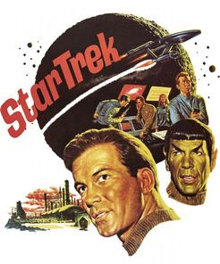
ADDENDUM: The cover to Star Trek 1 is conspicuously different. In fact, its illustration repurposes a promotional painting by American Realist James Bama (left), commissioned by Desilu/NBCTV to promote sci-fi-convention screenings of the show’s successful second pilot (“Where No Man Has Gone Before”). Technically, the reproduction of elements from that episode is perfectly accurate—but note the antiquated early-’Sixties montage style (reminiscent of the legendary Robert McGinnis James Bond posters) which stands in sharp contrast to the post-Roger Dean near-psychedelia to come. With the progression of these paperback covers you can see the ’Sixties happen.
ADDENDUM II: Paintings within paintings: a sharp-eyed examination of Bama’s montage (composed of images from the filmed episode) reveals that the view of “the Delta Vega Mining Installation” in the bottom left corner is itself a depiction of the show-stopping artwork by famous cinematic veteran matte artist Albert Whitlock (the original composite shot can be seen here).


