Meadow House 1
Tuesday, November 29th, 2016 • Design
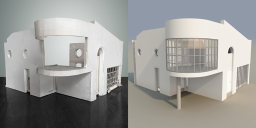
My first full-scale architecture project started in Robert Meredith’s Advanced Architecture class in high school, wherein eight or nine students were given a final assignment of conceiving a small-to-midsize dwelling and executing a certain number of drawings—all done by hand, with pencils and Koh-i-Nor Rapidograph pens on vellum—and an optional model which I attempted but did not complete (below left). My design was heavily influenced by Le Corbusier and by Philip Johnson, and, to a lesser degree, by the contemporaneous “Hi-Tech” stylistic movement which inspired me to hang industrial steel catwalks across the living room (see images below).

1983 model (foamcore, cardstock, mylar); 2016 model (digital) (click for larger view)
That summer I got my very first job, at Peter Eisenman’s firm. Eisenman, one of the “New York Five” architects (along with Richard Meier, Michael Graves, Charles Gwathmey and John Hejduk) who had come to great prominence and notoriety thanks to an influential 1970 Museum of Modern Art exhibit (curated by Philip Johnson) and an accompanying book, Five Architects (1972), had just won the competition for Ohio State University’s Wexner Center for the Arts, his first major non-residential commission and the first large-scaled implementation of his influential principles of “Deconstructive Architecture.” I spent two summers working for Eisenman, assisting on drawings and building charette models for the Wexner Center and other projects (including an unsuccessful Trump proposal that involved my carrying a Plexiglas model ten blocks up Fifth Avenue to Trump Tower, and the future-President’s outer office) and would have pursued an architecture career had I not sold my first novel while in college.

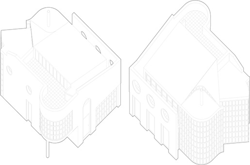
Front and rear axonometric views (1983, 2016) (click for larger view)
When I first met Peter, I showed him the “Meadow House 1” drawings (I was mimicking the Eisenman practice of numbering houses, which Tom Wolfe ridiculed for stripping away all traces of the clients’ identity or relevance—in his From Bauhaus to Our House (1981), he excoriated Eisenman’s essays as achieving “perfect obscurity”), and he took my drawings around to the other architects, saying “Look what this kid did, with no knowledge” (a backhanded compliment that I still treasure). Eisenman said he especially admired the originality and quirkiness of the design, and gravely informed me that, as I advanced upward in the discipline of architecture, my ability to conceive this sort of unusual structure would be systematically diminished over the coming years as summer jobs and postgraduate training leeched away whatever personal vision I might have had, forcing my work into a more and more doctrinaire mimicry of the prevailing trends of the time. (Eisenman’s iconoclastic negativity was consistent as long as I worked with him, as was the densely rigorous academic framework from which he disdained the architectural academy; he would, in the next few years, collaborate with Jacques Derrida on projects for the Venice Biennalle.)

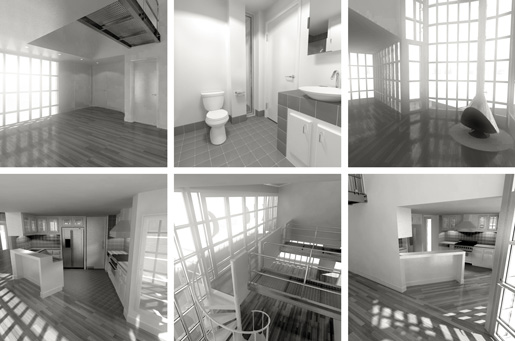
Interiors (from the 2016 digital model) (click for larger view)
Decades later, when I started doing animation (beginning with my Buehrig Design project, a commissioned museum gallery exhibit for which I digitally reconstructed my grandfather’s 1938 Cord Beverly luxury-car masterpiece so as to explain and illustrate his groundbreaking paper-to-clay-to-steel 3D-design techniques), I excavated the Meadow House 1 drawings and model for the purpose of building a full-scaled digital model, which I finished this summer. This new project split into two stages: completing the abstract design (meaning, the nine drawings that convey the idea) and the detailed conception and execution of the model, which was significantly more involved and difficult. For that second part, I worked out the steel-and-concrete support structure of the building (which I’d ignored in high school) and researched modern curtain-wall technology (with double-glazed glass, etc), since I’d decided to execute the design as it would be done if built today—I used contemporary lighting and bathroom fixtures, door/window/cabinet hardware and kitchen appliances (based on the downloadable models and schematics which are now commonplace on houseware manufacturers’ websites).
Now that I can finally see the design in three dimensions, inside and outside, I think it fulfills its modest ambitions (which was not the case with my second Meadow House project, created four years later while I was in college and, as Eisenman had predicted, burdened with a far more slavish and unoriginal design ethos as the dubious “Post-Modern” architectural and aesthetic movement held me in greater and greater thrall). This house, like the early-20th century landmarks that inspired it, would be difficult and expensive to own and occupy—the internal climate would be nearly impossible to frugally maintain, and the stucco/concrete walls would quickly become streaked and stained as happened chronically with Bauhaus-era buildings. Still, it’s a respectable pure-modernist structure, obeying—for the most part—Cobusier’s five points of architecture and essentially upholding the basic tenets of early-20th-century Modernism. As a design conceived on paper and executed with computers, Meadow House 1 spans an arc of my life from visual design, away and then back.
See a complete gallery here: www.jordanorlando.com/mh